Wibble - iOS app
Vlogging made simple
*The app and official website were taken down due to company closure.
Case study summary
We aim to build the simplest vlogging app for users with basic social media knowledge. Our app offers easy capturing, editing, and quick sharing capabilities to help users create great vlogs with ease.
Lack of an intuitive app solution that allows beginner vloggers to create vlogs easily on the go.
An iOS mobile vlogging experience that allowed users to create content 3X faster than the available apps. The best is yet to be explored.
My role
Product Designer
Timeline
AUG 2019 - FEB 2022
Team
2 founders
2 developers
1 digital marketer
1 Product designer
Responsibilities
Research
Define
Ideate
Prototype
Test
The research & Analysis
Tedious process to create vlogs on mobile as vloggers
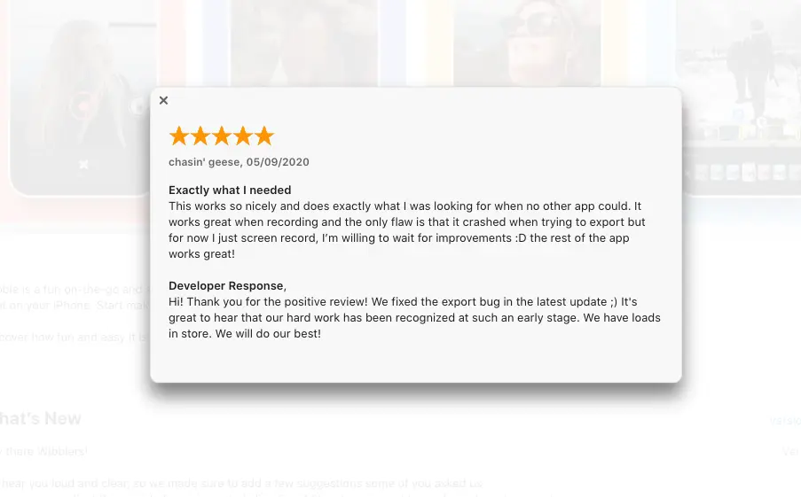
Our founders served as our first users, providing valuable insights and feedback on the app's features and functionality.
To eliminate biases and gain a wider range of perspectives, I conducted interviews with five external potential users.
To further empathize with our users and approach solutions in a user-centered manner, we conducted body-storming sessions with our team.
“Our research found that the competition lacks an intuitive solution for vloggers. We used SWOT analysis, our experience, and user interviews to identify the potential market gap for Wibble."
Key insights
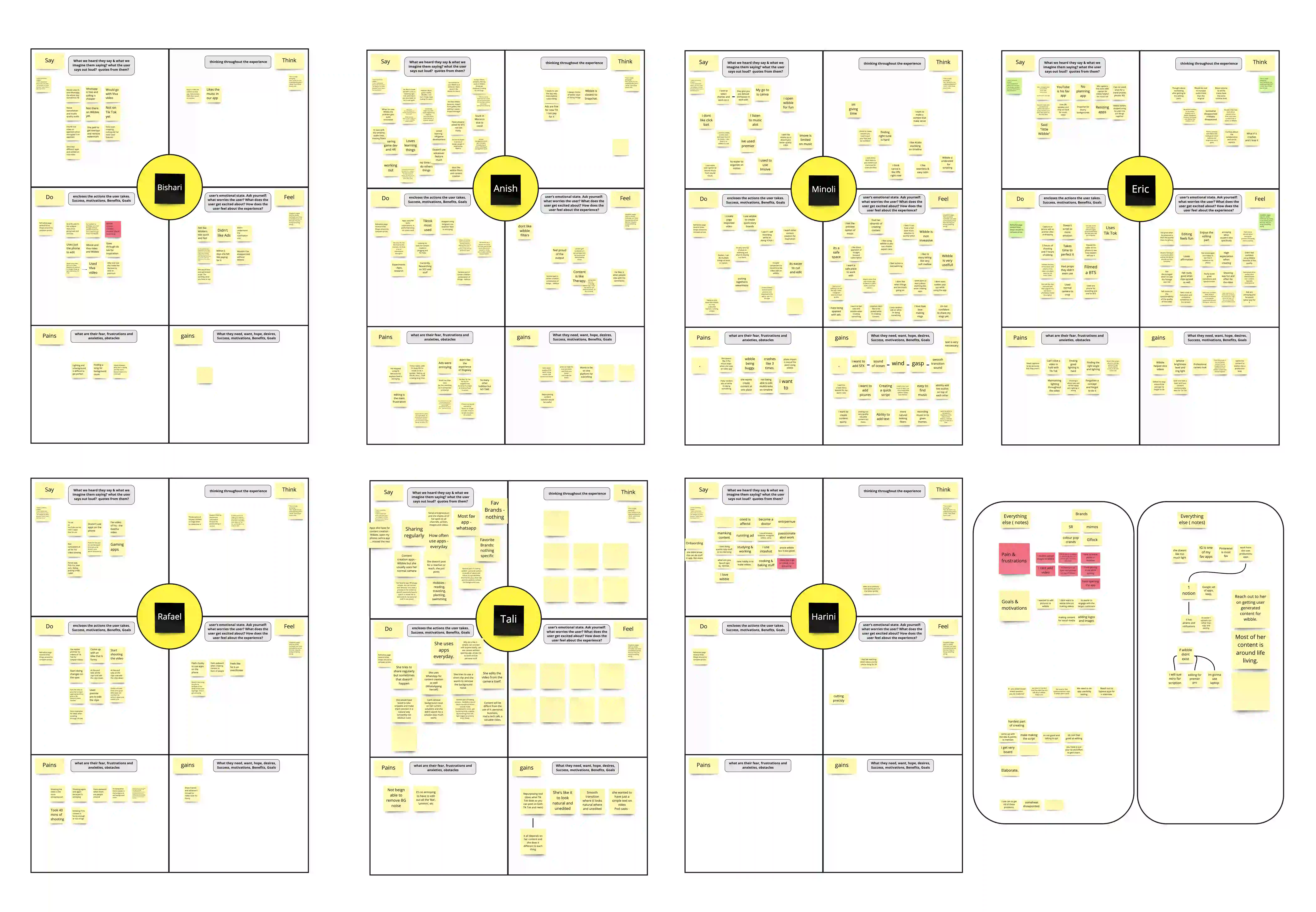
We used empathy and affinity mapping to analyze our research data and identify key insights. This helped us generate "How might we..." questions for the ideation phase.
Long hours of editing (minimum 1-2 hours)
Lack of editing skills
Piled-up videos on mobile devices
Frustration with finding nice royalty-free music
Re-watching videos to select certain clips
Using multiple apps to record and edit vlogs
Self-doubts and social challenges while recording videos
THE IDEATION
Collaboration and co-creation is the key...
"How might we design an on-the-go vlogging app for beginner vloggers that enables them to create vlogs easily and quickly, so they have greater mobility in daily activities while saving time?"
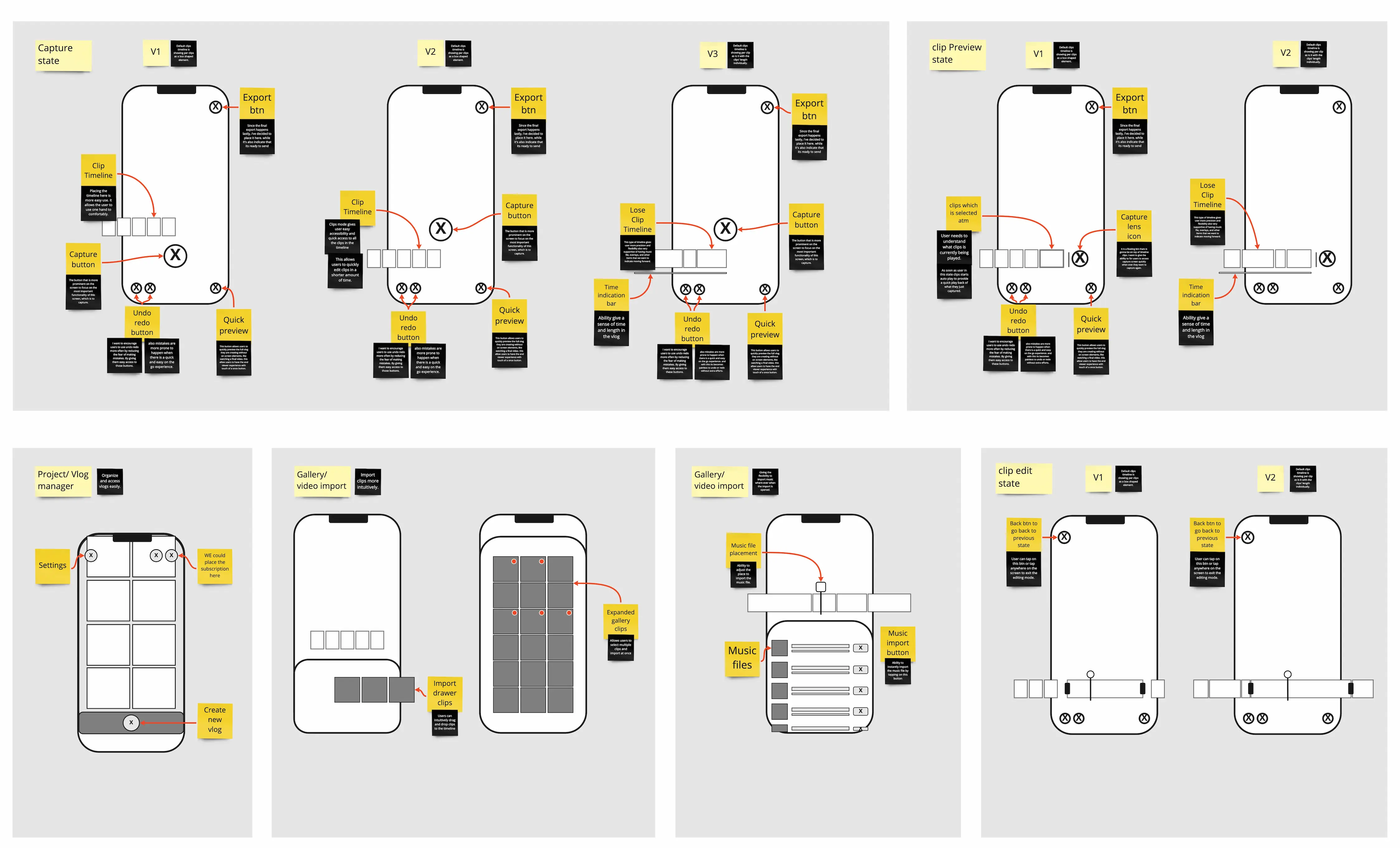
We used mock-ups and prototypes to eliminate ambiguity, collect feedback, and validate our assumptions.
MVP scope
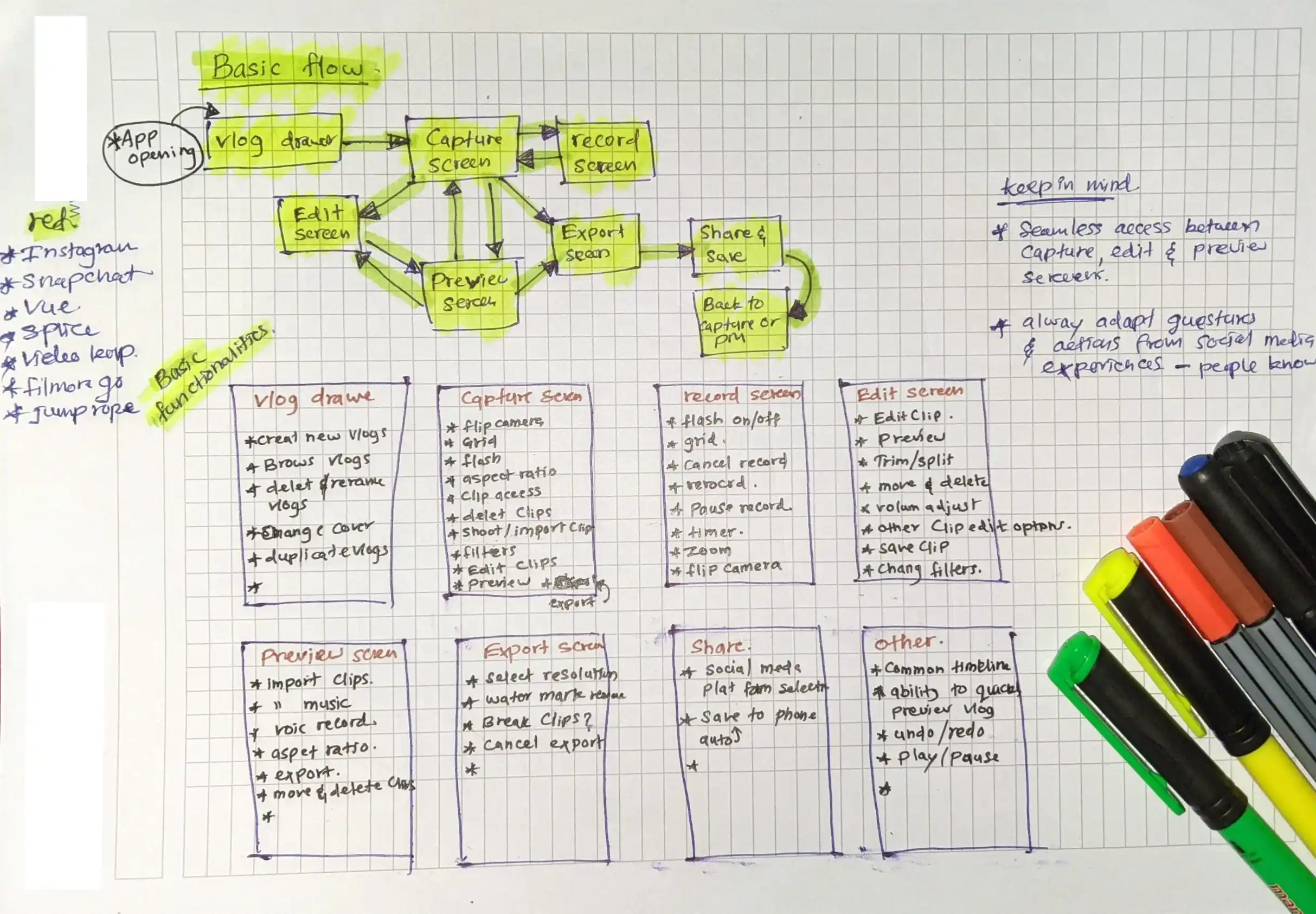
I provided broken-down versions of each feature to developers to ensure easy implementation. Tools like Miro, Zeplin, Principle, Figma, and Looms were useful in this process.
We used an impact-effort matrix to visualize the most relevant ideas and focused on reshaping and iterating these ideas towards product-market fit.
THE Solution
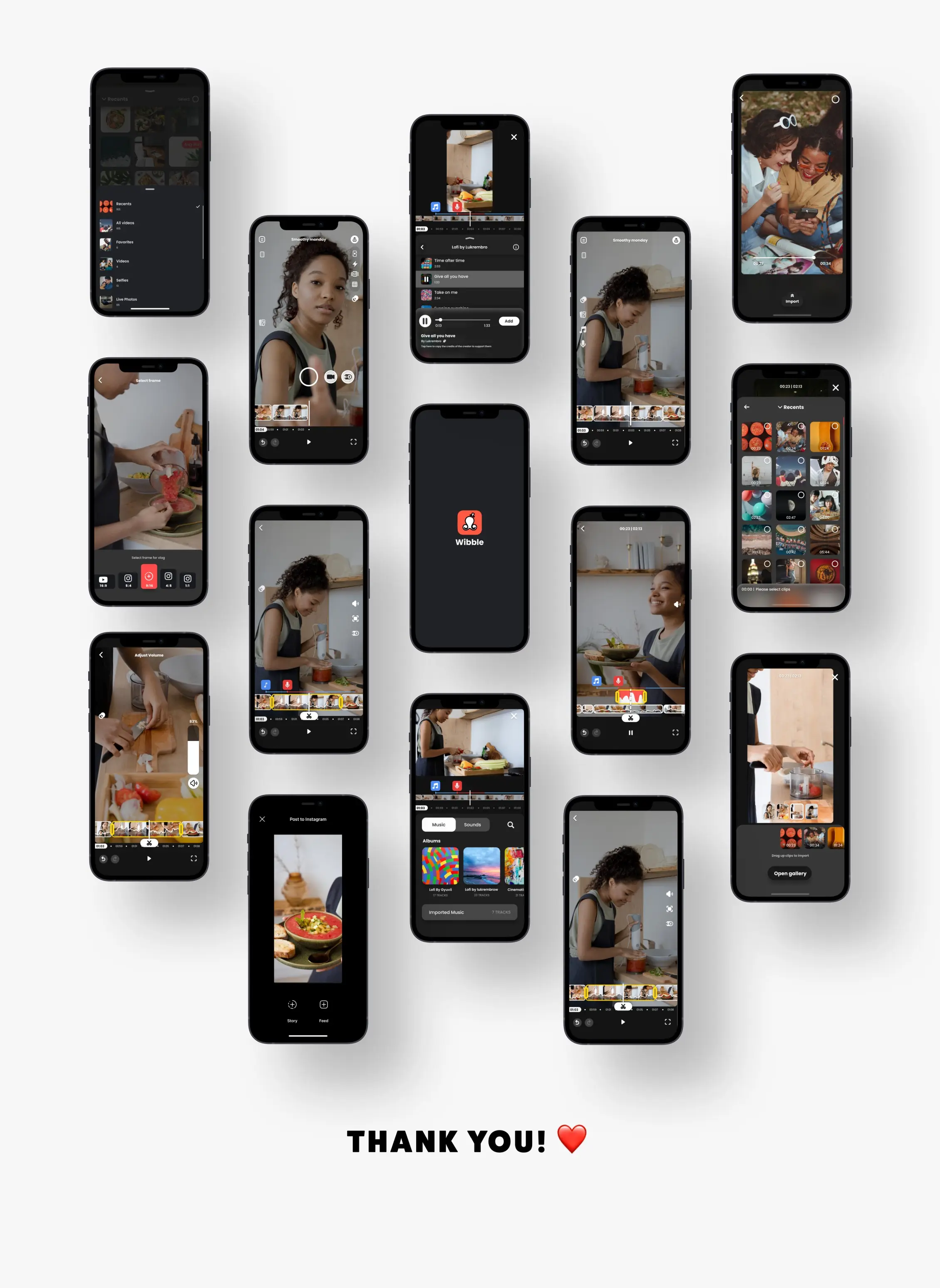
3x faster mobile vlog creation...
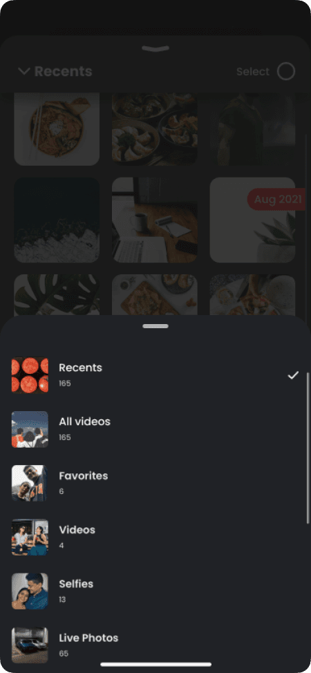
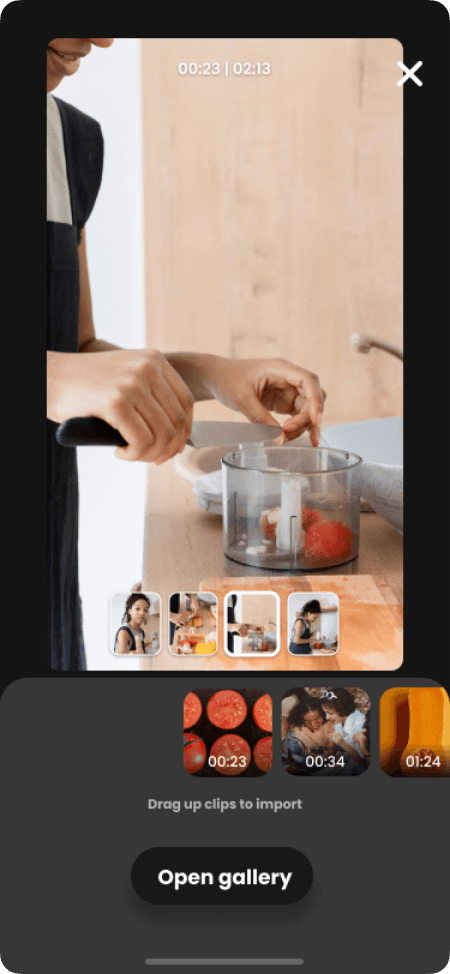
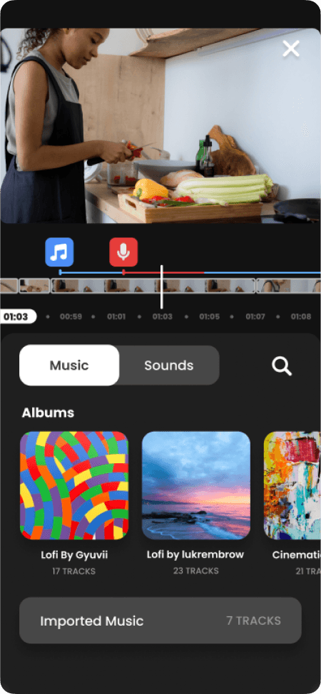
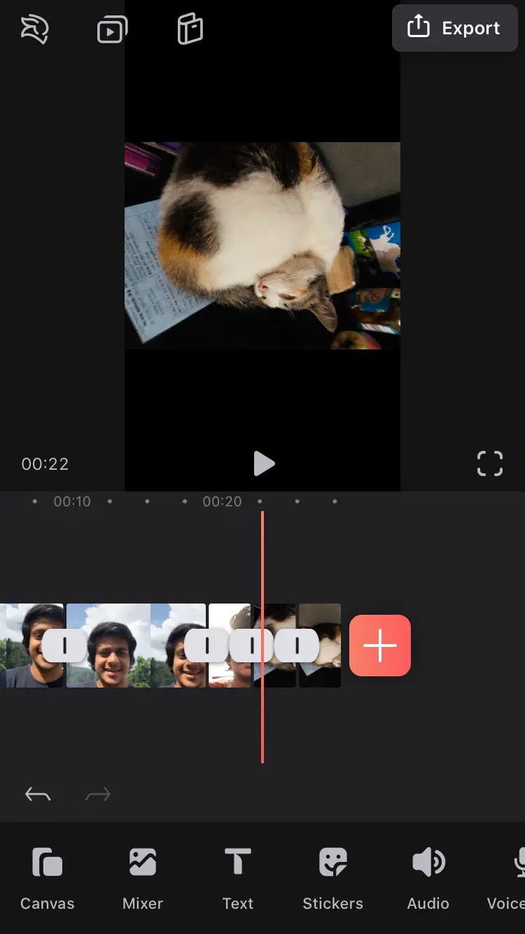
A mobile experience which fits in your pocket that turns hours of video editing into seconds.
THE TESTING
Constant testing helped us to iterate and refine the experience
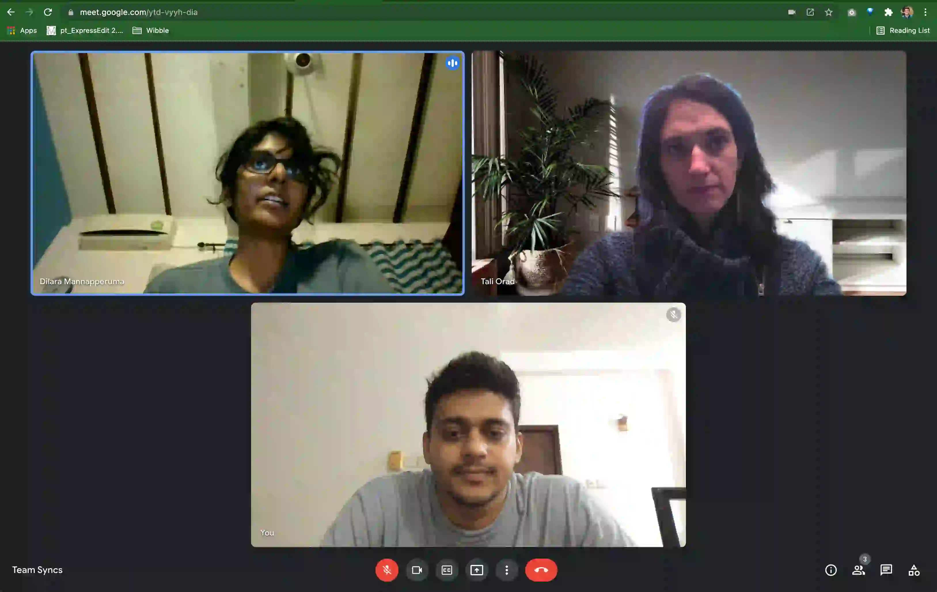
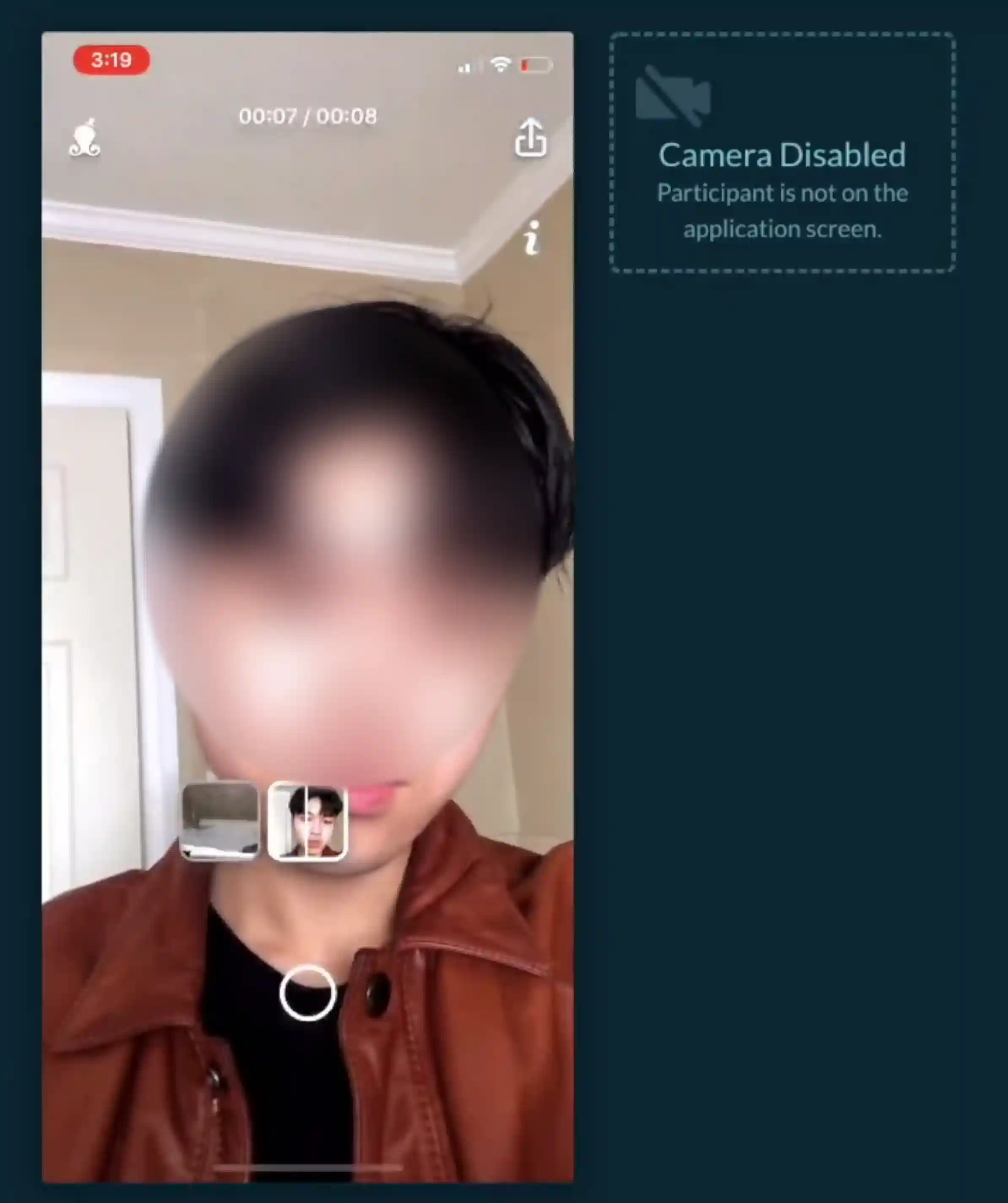
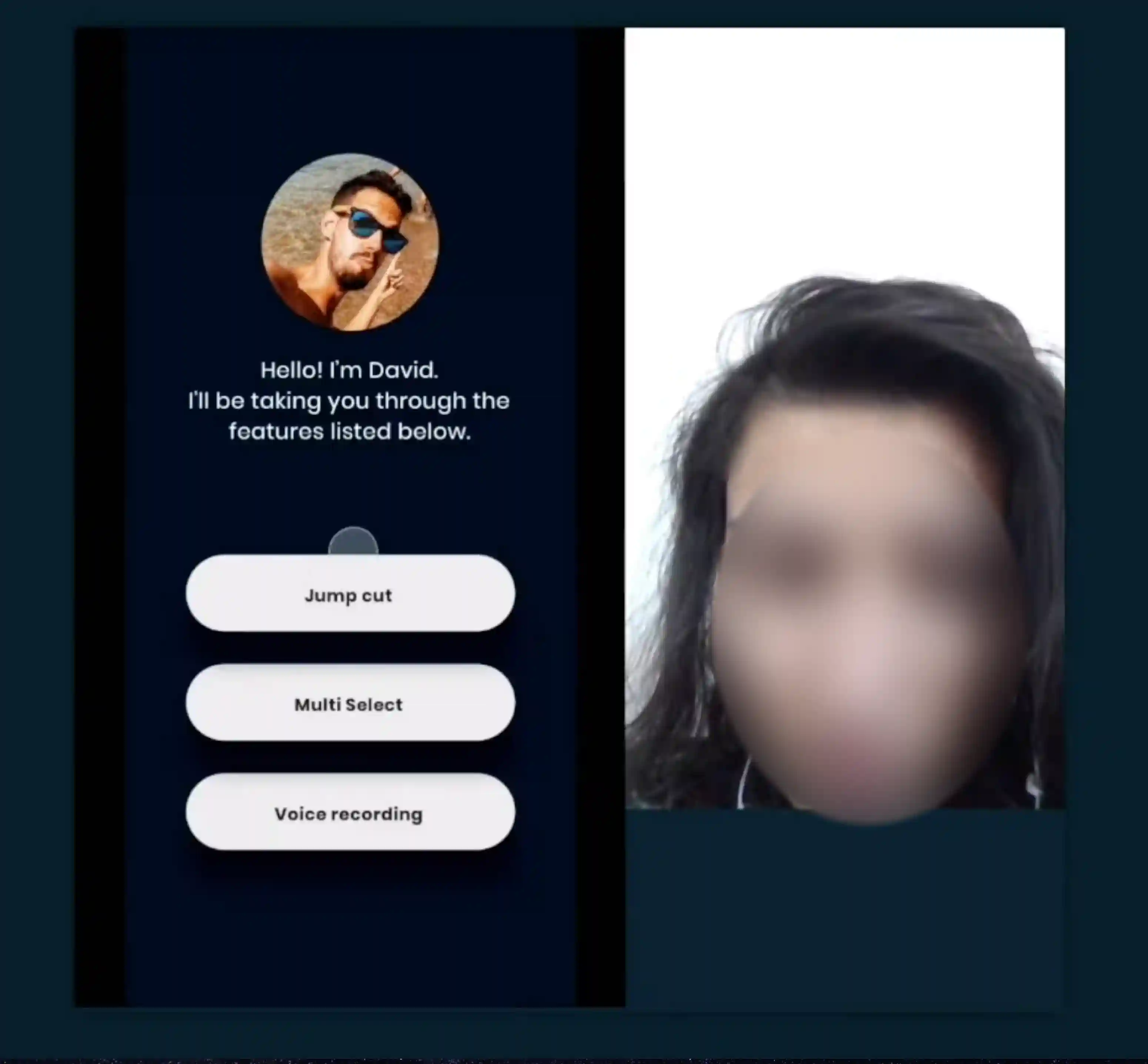
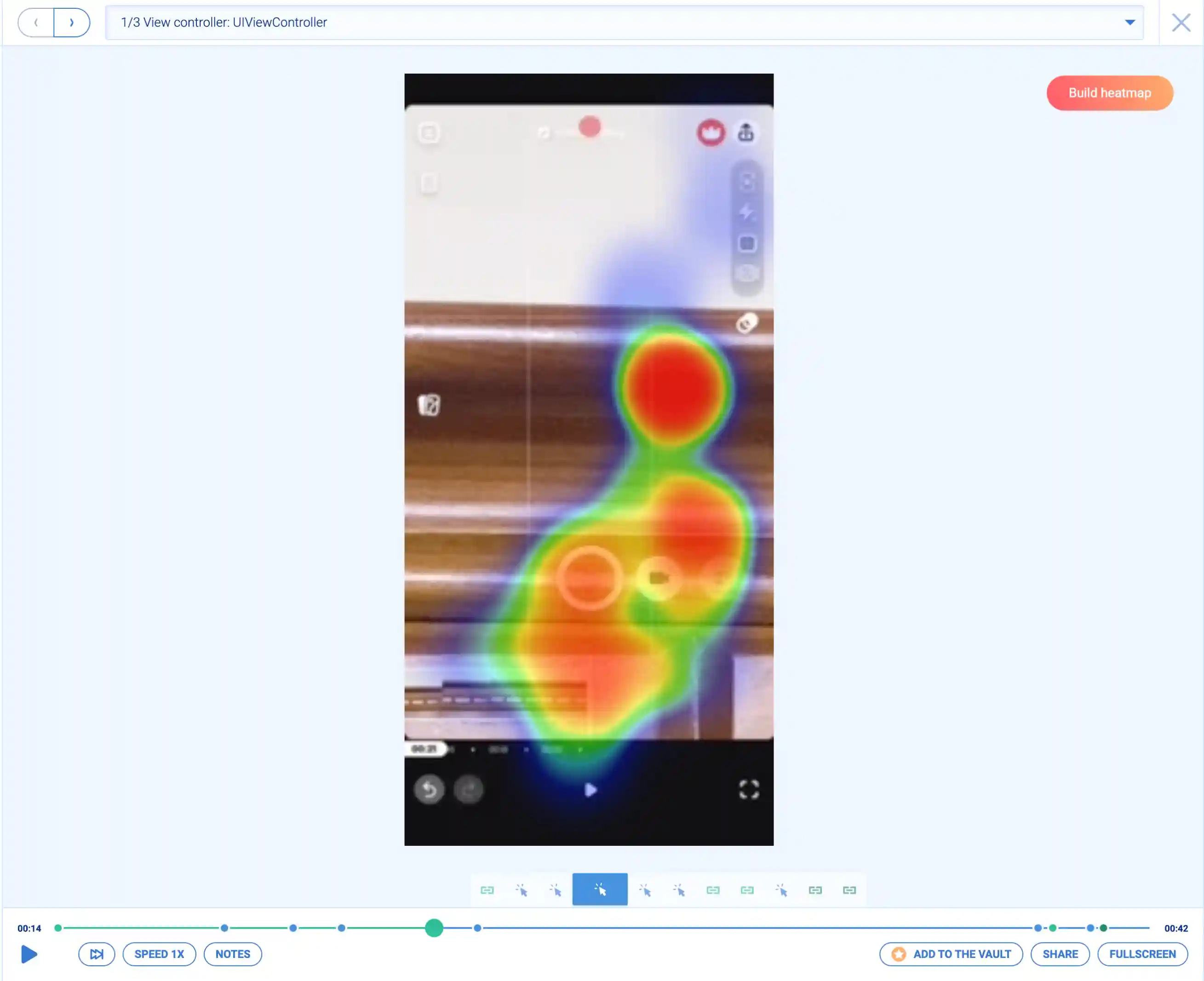
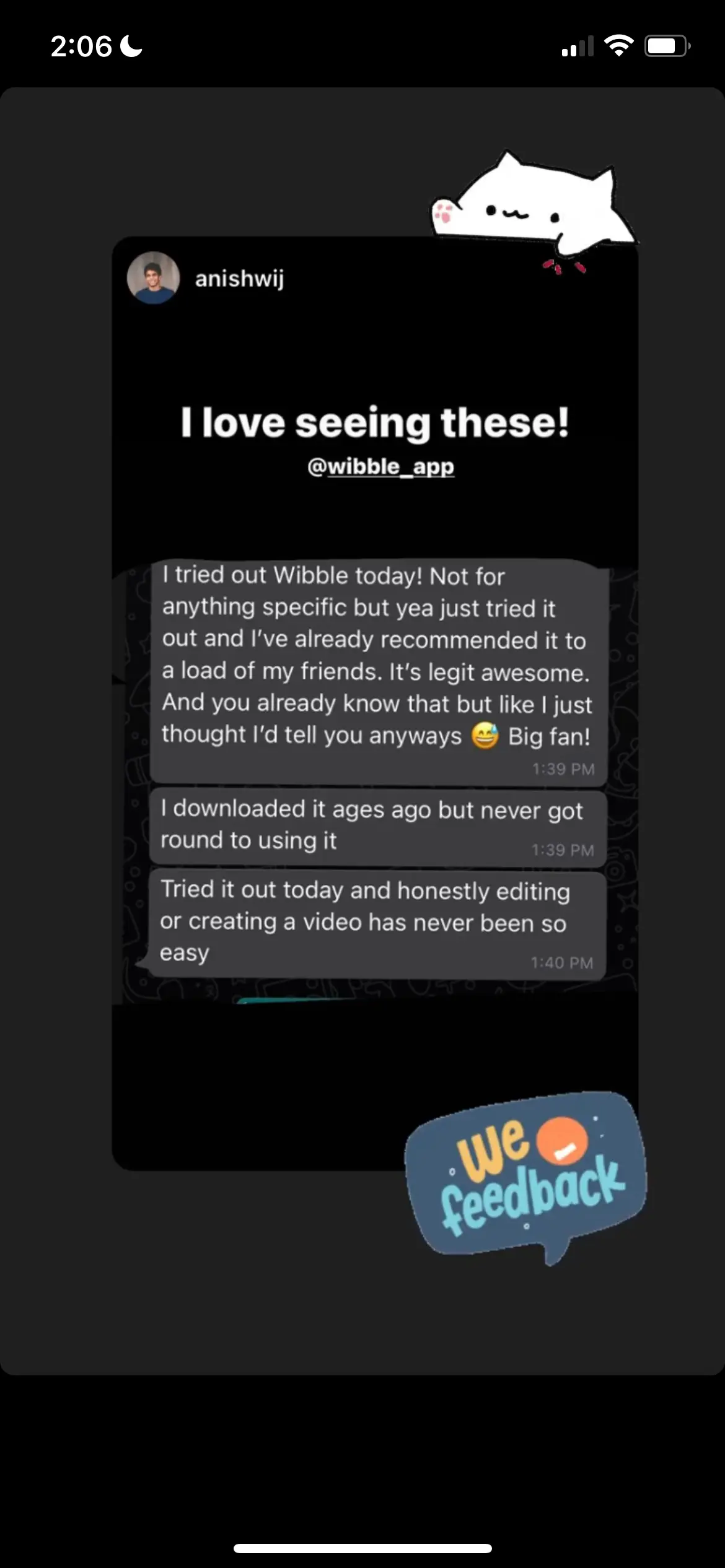
Moderated remote usability tests revealed that testers loved the simplicity, clarity, and intuitiveness of the app
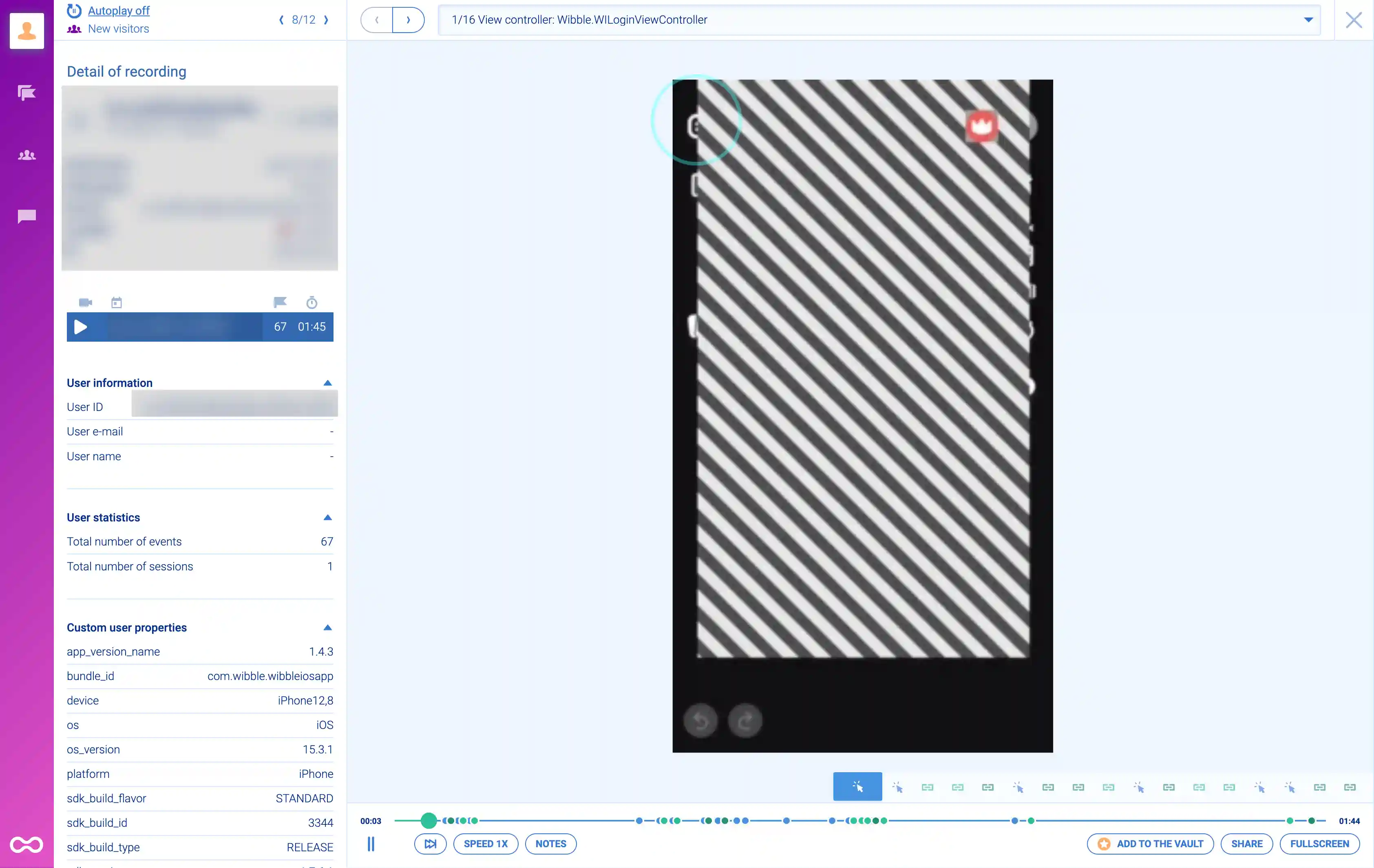
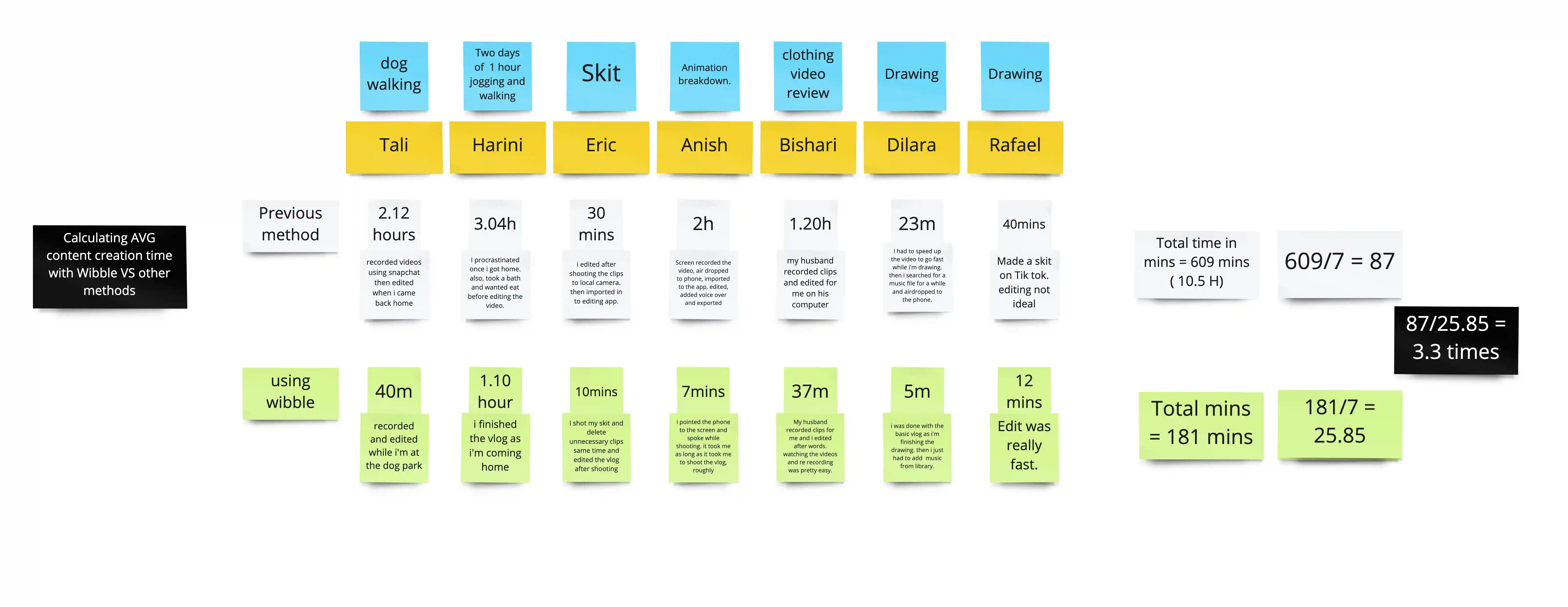
Unmoderated user testing showed us that our app enables users to create vlogs 3X faster than the standard methods.
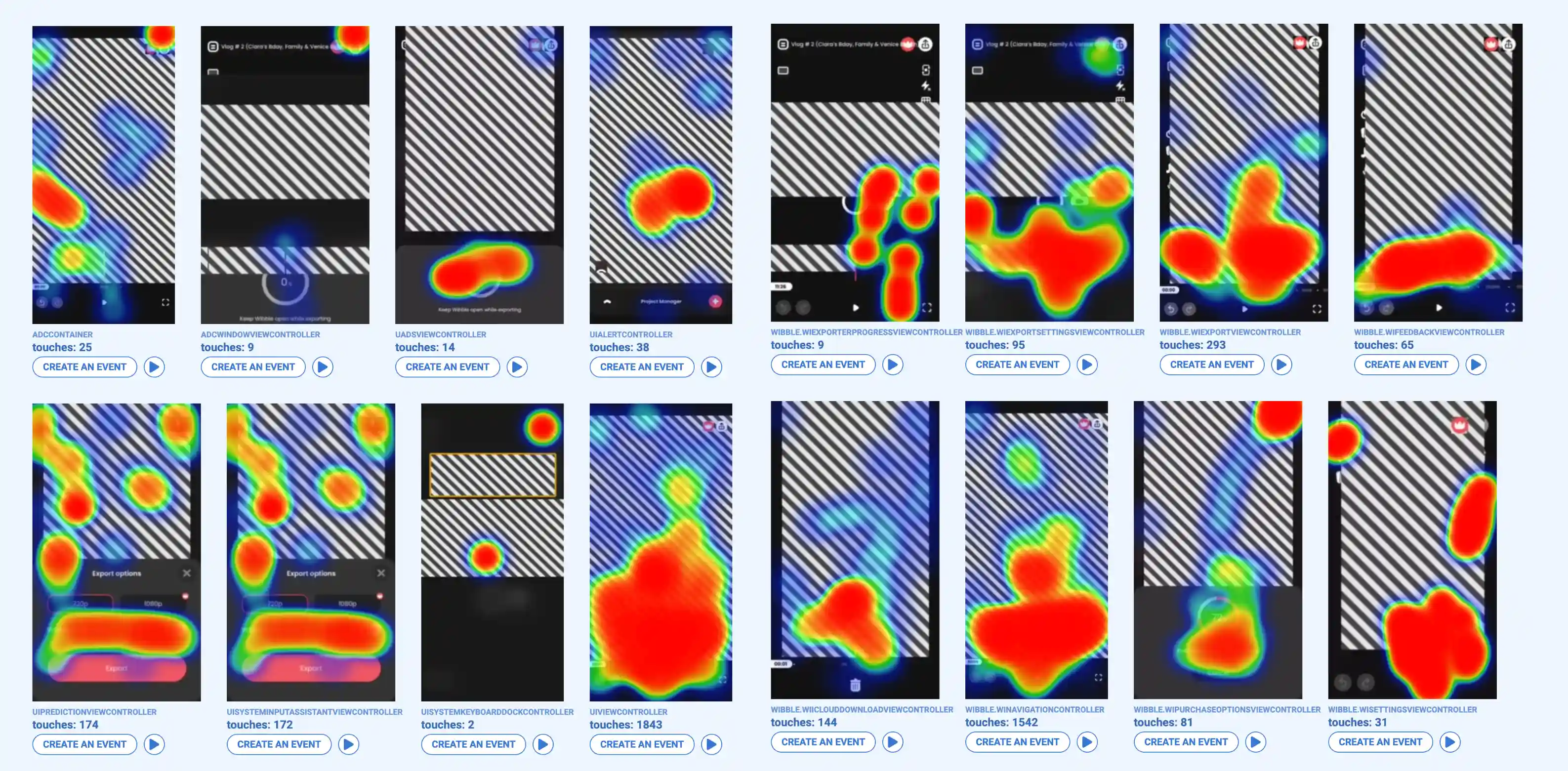
We conducted ongoing testing of the app throughout the design process to validate our assumptions and gain a deeper understanding of user behaviors. This enabled us to iterate and improve the app.
Version 1
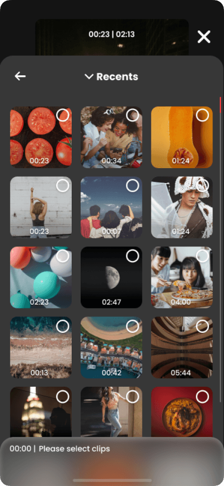
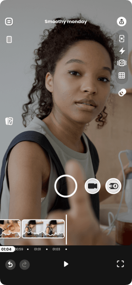
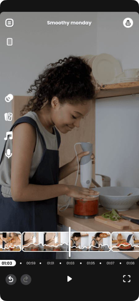
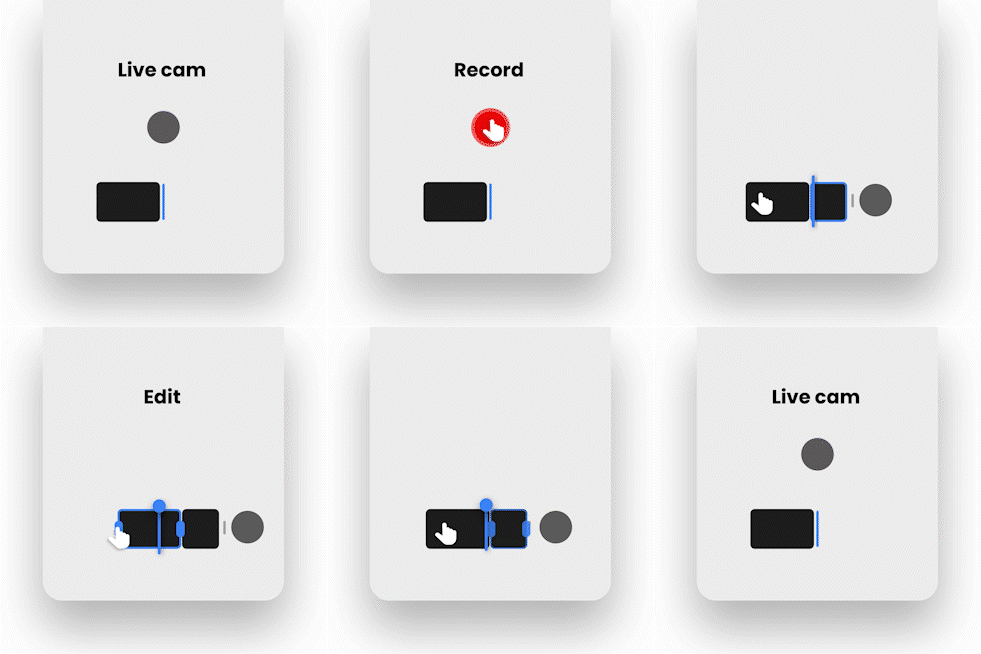
Simultaneous access to both recording and editing
Instant recording & simple editing.
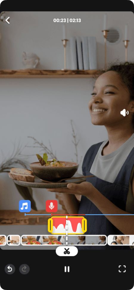
Quick preview of what you just created
Version 2
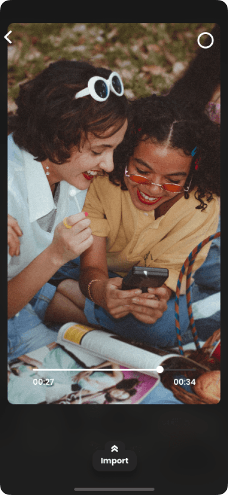
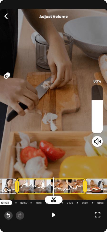
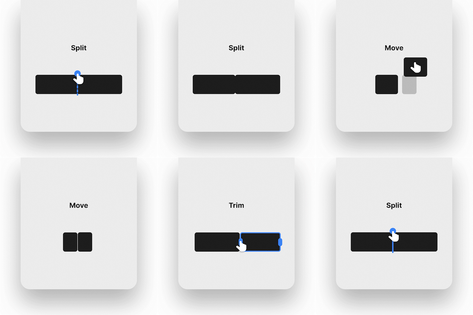
Easy single-hand use. Beginner-friendly intuitive trimming, editing, and moving videos
Quick access around the timeline with easy gestures
Version 3
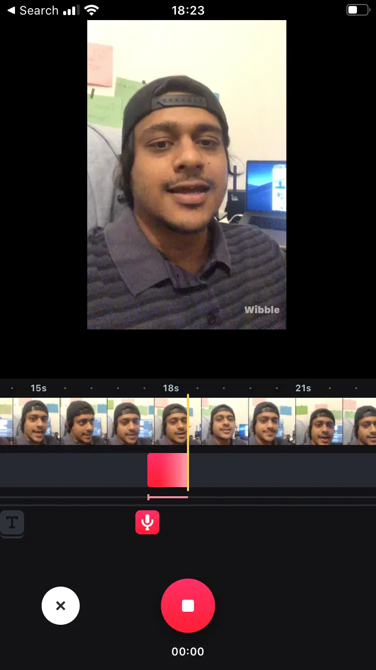
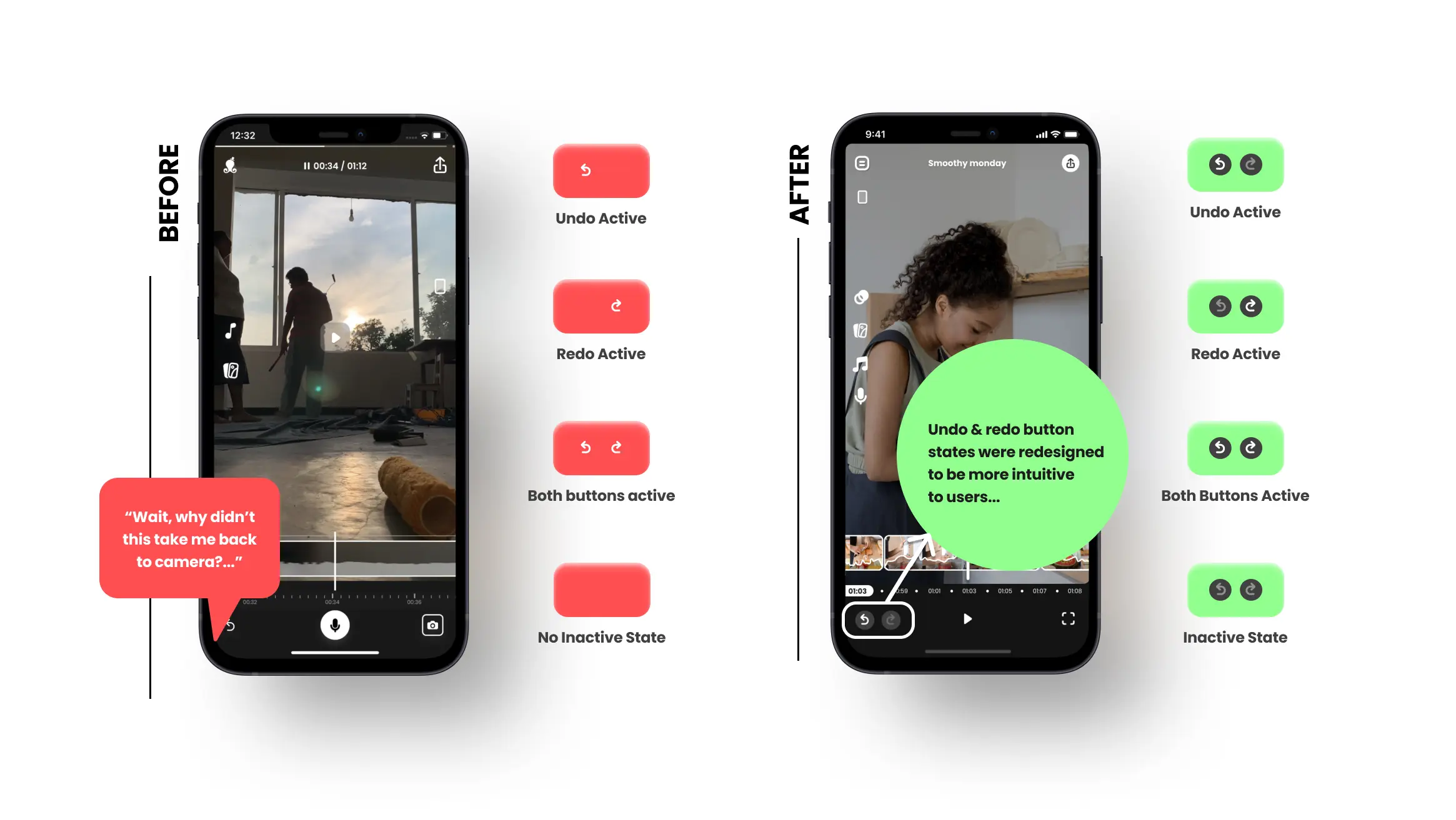
Capture on the go with auto-editing lenses
Eliminating the need for editing
Flexibility in adjusting and re-editing videos
THE Feedback
Too early to determine a successful product market fit
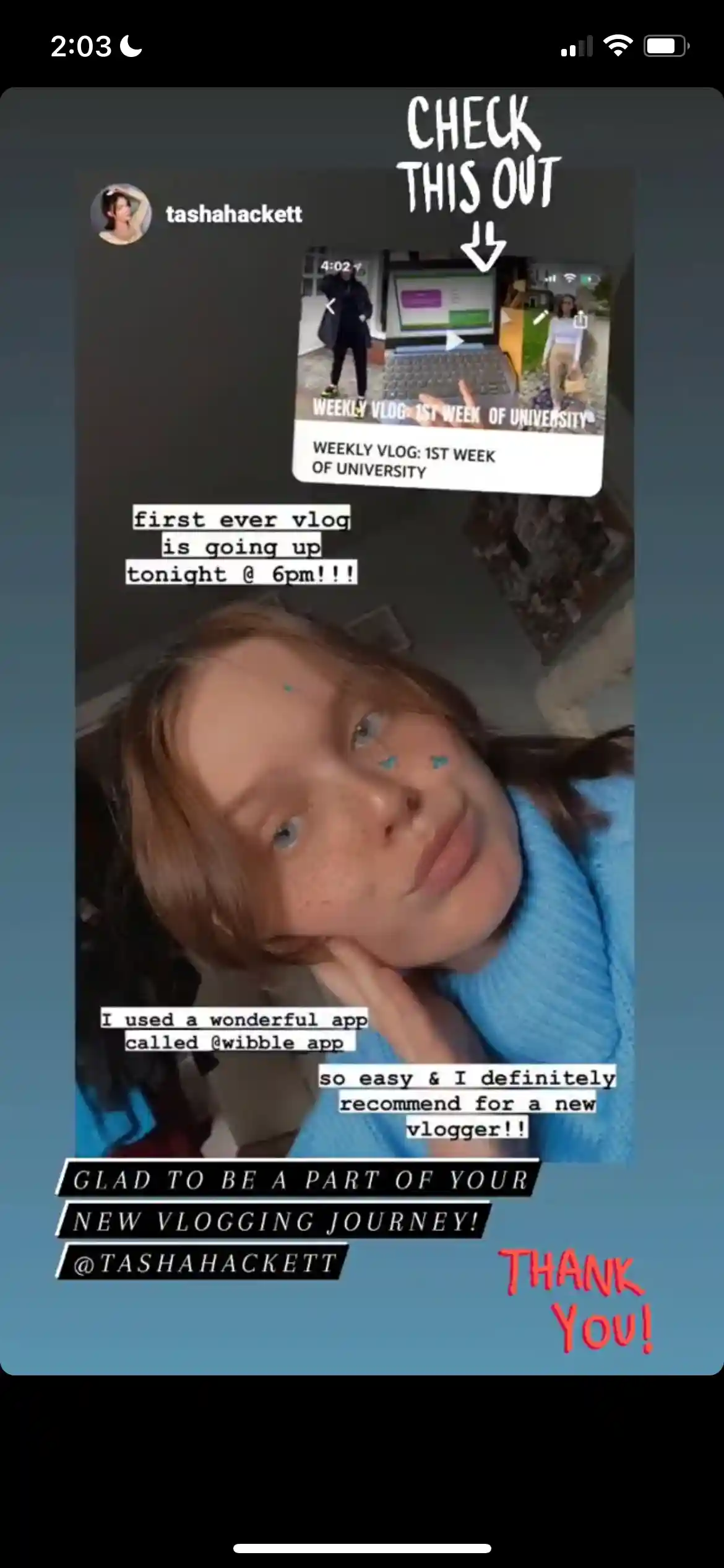
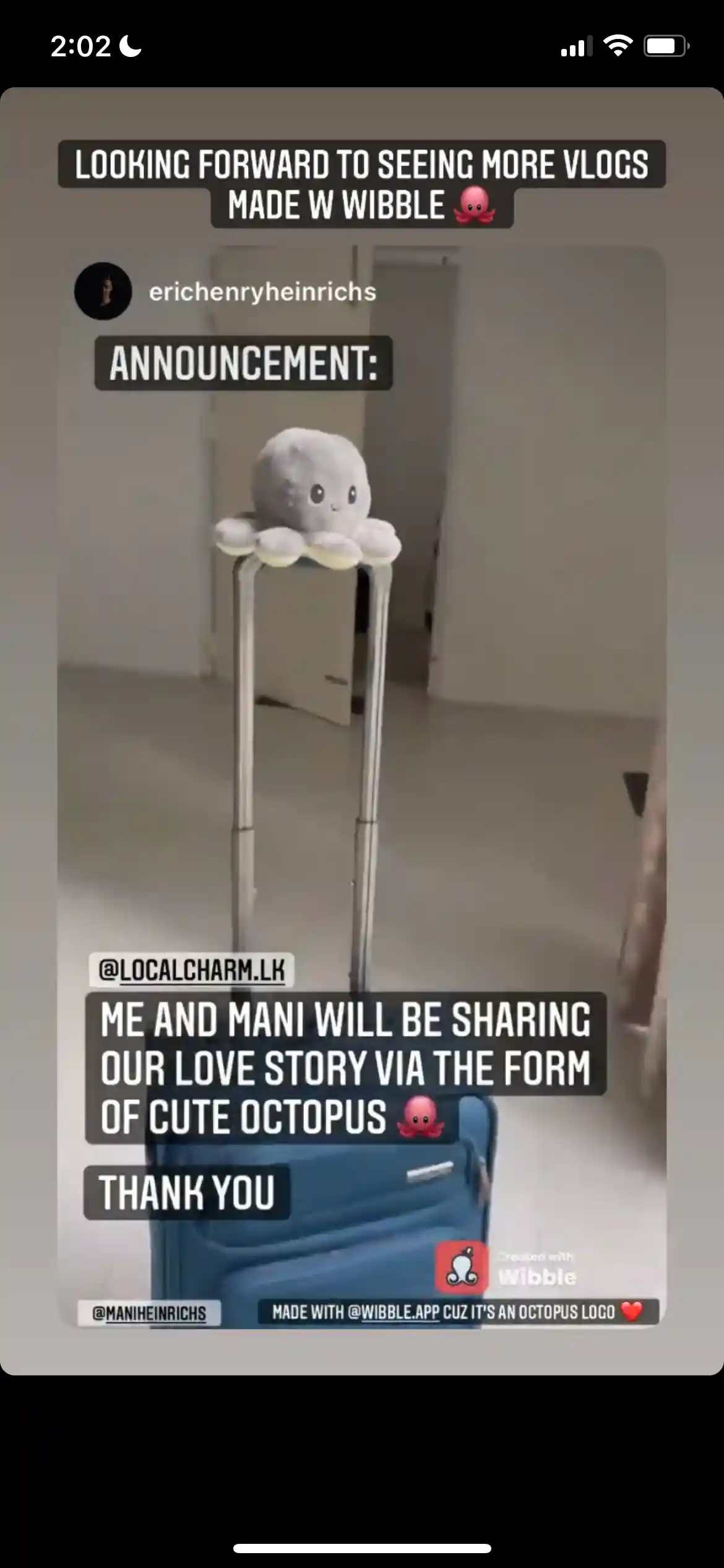
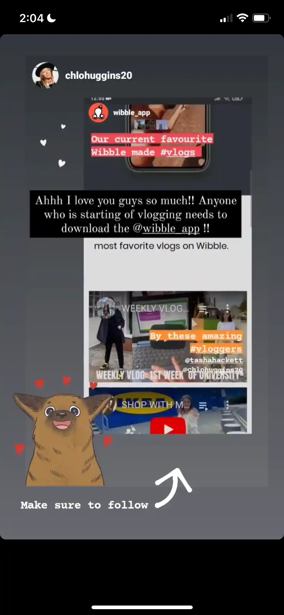
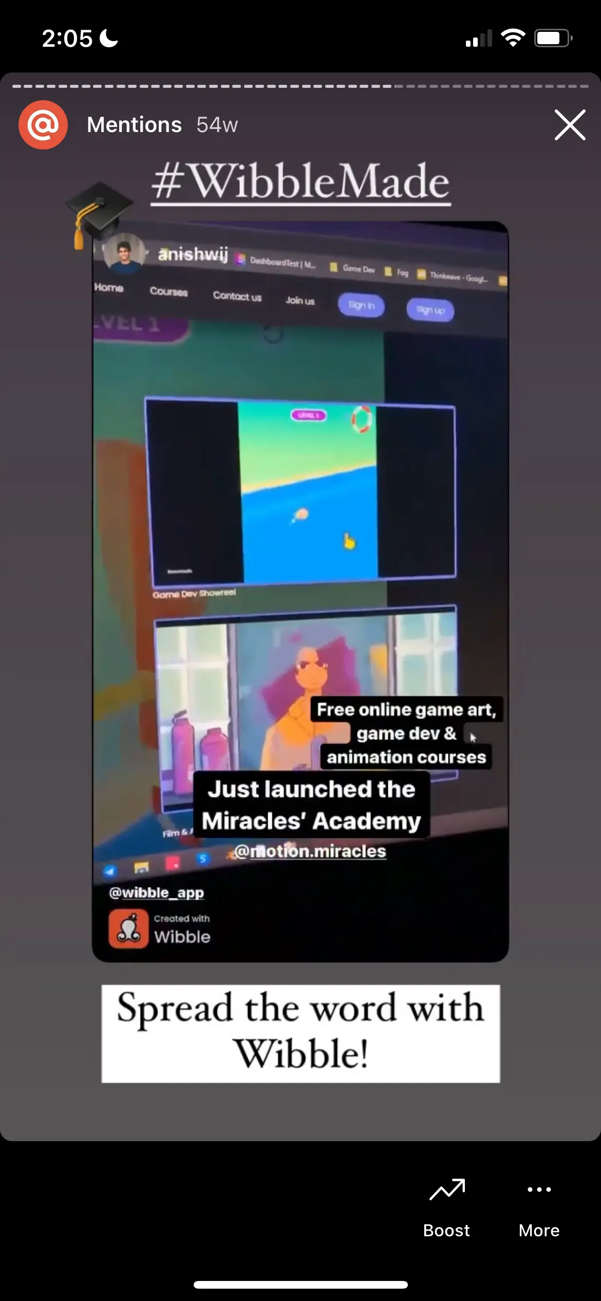
We had a small community that supported us throughout the development process. With their help, and by learning from our mistakes, our team was able to shape the app to its current state. We are grateful to all of our supporters and would like to say thank you to them.
Key findings
3x faster outcomes for vloggers than their previous ways of content creation
Reduced the unnecessary amount of pilled-up clips in phones
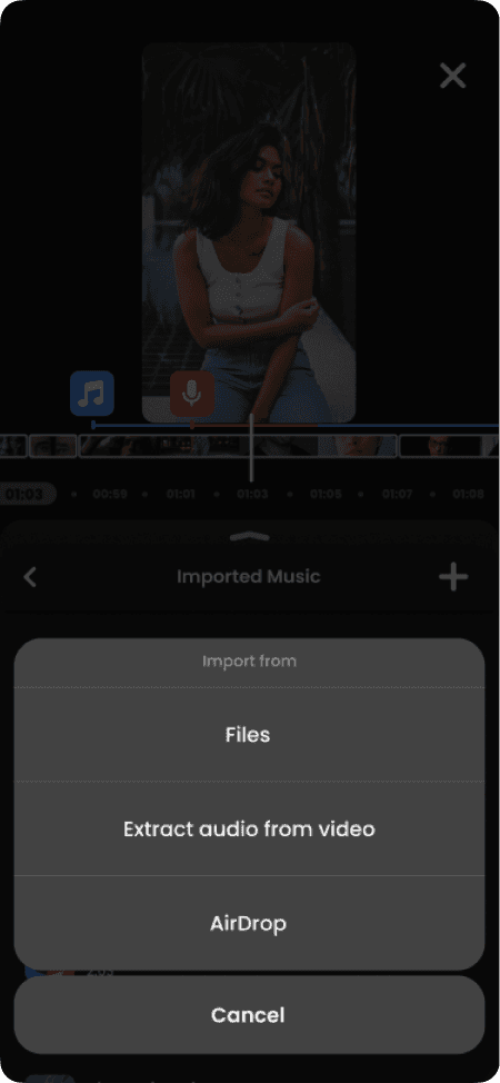
Loved the royalty-free music in the app and they requested more variety of music
People are using Wibble to quickly visualize their bigger concepts and ideas in a short amount of time
Failed to gain subscriptions but ads seem to be working for the current version
Using Wibble as a behind the scene capturing tool
Testers are willing to pay for advanced features
What did i learn?
I learned and grew a lot from this project, many of the lessons coming through hard experience. Working at a startup is unpredictable, but that was also the most exciting part of it. I observed something new every day and gained multiple skills I never thought I would learn. Here are some of the key things I learned.
Taking initiative
I learned the importance of taking initiative. At startups, things can be unclear at the beginning, so it is up to us to shape and clarify them as we go along. This often required me to step out of my comfort zone and take on additional responsibilities, both within and outside of my designated role. This not only helped the company grow, but also helped me grow personally.
Beginner mindset
I learned the value of a beginner's mind set while designing this app. As someone who loves video editing, it was a challenge to detach myself from my prior experience and relate to the specific market segment. However, the more I started to think like a beginner, the more intuitive and practical ideas came to mind. This helped not only in the design process, but also in communication within the team.
Effective communication
Clear and concise communication is really important. This is from exchanging ideas, sharing knowledge, updating your progress to handing-off designs. it’s always good to use multiple mediums to communicate and eliminate ambiguity. Also, it's really important to ask as many questions to clarify something as well. So that the message is received and understood with clarity and purpose.
Make the perfection a journey
Waiting for something to become perfect is an endless process. Asking for feedback as early as possible helped me design outcomes that resonated with the end-user more quickly. This also became a useful practice for testing and discussing technical constraints and limitations with the development team that could hinder our ability to achieve desired outcomes.
